3D Animated Website With One Prompt: Claude Fable 5 vs Opus 4.8 (Full Prompts)

I built a 3D animated smartwatch website with one prompt inside Claude Code, then tested the same prompt on both Claude Fable 5 and Opus 4.8 to see which model handles 3D, scroll animation, and real product detail better.
Watch the full build here, and grab the exact prompts I used below so you can build your own.
Prompt 1 — the main build
Build ONE self-contained HTML file (inline CSS + JS) — a premium animated product page for a fictional smartwatch: the “ORVEL Pulse” (brand ORVEL, model Pulse). Tagline: “Every moment, measured.” Mobile-responsive, production-quality. Use GSAP + ScrollTrigger, Lenis for smooth scroll, and Three.js for the 3D watch. Apple-product-page caliber. Three sections, in order:
## SECTION 1 — HERO: scroll-scrubbed video
– You have the Magnific MCP. Generate a short, high-quality VIDEO of the ORVEL Pulse on a wrist: mid-shot, then smoothly pushing IN to a tight close-up of the glowing watch face. Cinematic, premium lighting, clean background.
– Wire it as a TRUE SCROLL-SCRUBBED video: section pins (sticky), scroll progress drives video playback frame-by-frame (scrollProgress → video.currentTime, or canvas frame-draw). Scroll down = advances, up = reverses. Must scrub with scroll, NOT autoplay. Buttery, no jank.
– Overlay: “ORVEL Pulse” + tagline fade in as the zoom lands.
## SECTION 2 — REAL 3D WATCH + FEATURES (integrated)
– Build an actual 3D smartwatch in Three.js from primitives/extrudes (case, bezel, screen, strap, crown — no external GLB). Premium materials, real lighting, soft shadows.
– The watch ROTATES/tilts as the user scrolls this pinned section — a slow, controlled reveal from multiple angles, scroll-linked (not free-spinning).
– The 4 features appear as LABELS that point AT the rotating watch — a thin connector line from each label to the relevant part (crown, screen, strap, side) — revealing one at a time as the watch turns to that angle. Integrated annotation style, not cards beside it.
1. Always-On AMOLED — 3,000 nits, readable in direct sun
2. 7-Day Battery — a full week on one charge
3. Medical-Grade ECG — clinical-accuracy heart rhythm
4. 50m Water Resistance — swim, shower, dive; sealed
## SECTION 3 — 3D WATCH TRANSITIONS INTO REVIEWS
– The SAME 3D watch from Section 2 transitions into the reviews section — you decide the transition (it may shrink and dock, move down, open, dissolve, or reframe). Make it feel like one continuous object carrying the user from features into reviews. Be creative and make it memorable.
– 4 customer reviews, 5-star, believable premium-tech copy (name, meta line like “Verified owner · 6 months”, quote). Refined layout with subtle motion.
## IMAGES
Use the Magnific MCP for the Section 1 hero video, and review customer photos if useful. Any image not generated → styled placeholder with an HTML comment directly above in EXACTLY this format: <!– IMG: [description] | [ratio] | [WxH]px –>. The 3D watch, icons, connector lines, dividers, decorative shapes = pure Three.js/SVG/CSS.
## DESIGN — YOU DECIDE
Premium tech identity: palette, dark/light, typography, motion. Before code, write a 3-line Design Rationale (vibe, fonts, palette hex, why).
## QUALITY BAR
Buttery scroll, real frame-scrubbing, real Three.js 3D (not faked), a memorable Section 2→3 transition, believable copy. Judged against another top model — make it distinctive.
Prompt 2 — the detailed refinement (different concept)
Build a premium product landing page for a fictional smartwatch, the “ORVEL Pulse” (brand ORVEL, model Pulse, “GEN 1”). This is an advanced, motion-heavy build — plain HTML/CSS/JS is not enough, so use the full stack: Lenis (smooth scroll), GSAP + ScrollTrigger (scroll choreography), and Three.js (for the 3D watch / GLB loading). You are free to bring in any additional libraries or resources you judge helpful (GLTFLoader, DRACOLoader, texture loaders, easing plugins, etc.). Output should run cleanly when served locally (assume a local server / VS Code Live Server — not file://).
Before you write any code, briefly narrate your build plan — the approach you’ll take to the watch asset, the video, the transition, and the overall structure — then build.
BRANDING — YOUR CALL: choose the full visual identity for ORVEL yourself — light or dark mode, colour palette, typography, and the best colour combinations for the CTA and the product/watch presentation. Pick what makes a premium smartwatch brand feel distinctive and high-end. (For reference, an earlier quick version went dark near-black with a green accent — you’re free to keep that direction, refine it, or take a completely different one.) In your Design Rationale, state the identity you chose and why.
SUGGESTED SECTIONS: HERO → CURTAIN TRANSITION / BRAND REVEAL → FEATURES → REVIEWS → CTA. Treat this as a strong starting structure, not a locked spec — if you can improve the flow, reorder, merge, or add a section that elevates the product story, do it. Keep the core moments (scroll-scrubbed hero, the reveal transition, features, reviews, a strong CTA) and keep the same watch throughout.
## STEP 0 — GENERATE & FINALIZE THE WATCH FIRST (critical, reuse everywhere)
You have the Magnific MCP. Before building any section:
- Generate the ORVEL Pulse watch as a UNIQUE cushion-octagon case — a rounded-square body with eight subtly chamfered edges. NOT round, NOT sharp-pointed. Luxury sports-watch language (Royal Oak energy), premium and architectural. On-screen: a heart-rate/BPM face.
- Use Magnific’s Image-to-3D to make a real 3D model (GLB) IF it produces a clean, loadable result. If 3D isn’t clean or a section doesn’t need it, high-quality generated IMAGES are perfectly fine — your judgement per section. It must look like a REAL, premium watch either way.
- Produce two colorways of the SAME octagon watch (your choice of premium finishes — e.g. a cool metallic gradient and a warm one). Not plain red/blue/black — aim for distinctive, high-end finishes.
- FINALIZE these assets before moving on.
– ABSOLUTE RULE: this exact octagon watch (same shape/design) appears in EVERY static section — reveal, features, reviews, CTA. Generate once, reuse. The product must look consistent across the whole page. This is the single most important requirement.
## STEP 1 — WRITE THE VIDEO PROMPT ON SCREEN, THEN GENERATE (hero video, watch must match)
Before generating the hero video, WRITE OUT your full Magnific video prompt in your response so it’s visible on screen — describe the shot in depth like a cinematographer: the real human, the wrist, the watch, camera move, lighting, mood, and the exact start and end frames. Then generate.
Critical — make the video watch match the finalized watch:
– Derive the video’s START and END frames FROM the finalized ORVEL octagon watch asset you made in Step 0 — do not invent a new watch. Generate a start-frame image (the finalized octagon watch on a real human wrist, natural mid-shot) and an end-frame image (the same finalized watch, tight on the glowing BPM face), using the finalized watch as reference so the shape and design carry through.
– Feed those two frames into Magnific as the video’s first and last frames so the motion interpolates between them and the watch stays as consistent as possible.
– Priority order if they conflict: (1) real, believable human wrist and cinematic zoom, (2) watch matching the octagon design. Minor variation on the moving wrist is acceptable; the static sections carry exact consistency.
– Use whatever Magnific resources give the cleanest result — image-to-video with locked start/end frames preferred over pure text-to-video, so the watch is anchored.
– Wire the result as a TRUE SCROLL-SCRUBBED video: hero pins, scroll progress drives video.currentTime frame-by-frame (or canvas draw). Scroll down = zoom in, up = reverse. Buttery — NOT autoplay-on-enter. Preload the video and show a tasteful loading state so the hero never flashes empty.
– Hero chrome: “ORVEL.” top-left, “PULSE · GEN 1” top-right, “SCROLL” cue bottom-center, headline “ORVEL Pulse” + tagline “Every moment, measured.”
## STEP 2 — BPM PULSE DRIVES THE CURTAIN TRANSITION → BRAND REVEAL
– As the hero zoom lands tight on the face, the BPM line PULSES — and that heartbeat pulse triggers the transition: on the pulse beat, a CURTAIN closes over the video (screen splits into 2–3 vertical panels sliding shut, theatre-curtain / sliding-door style). Tie the transition timing to the pulse so the heartbeat literally drives the scene change — this is the signature moment.
– Behind the curtain, reveal a split layout: LEFT = a framed box holding the octagon watch (one colorway, clean shot). As scrolling continues, the RIGHT side slides in with a short brand statement — 2–3 sentences on ORVEL’s philosophy (precision, titanium build, made for every moment). One choreographed premium moment, not a hard cut.
## STEP 3 — FEATURES (keep the scroll-open mechanic; same watch)
– Present the 4 features with a scroll-triggered “open/reveal” mechanic (features animate open as you scroll — this pattern works well, keep it).
– The watch shown MUST be the same finalized octagon ORVEL watch — not a different or generic watch.
– Features: 1) Always-On AMOLED — 3,000 nits, readable in sun. 2) 7-Day Battery — a week on one charge. 3) Medical-Grade ECG — clinical-accuracy heart rhythm. 4) 50m Water Resistance — swim, shower, dive; sealed.
– Optional: one feature can “open the watch” to show titanium framing / waterproof sealing — same watch design.
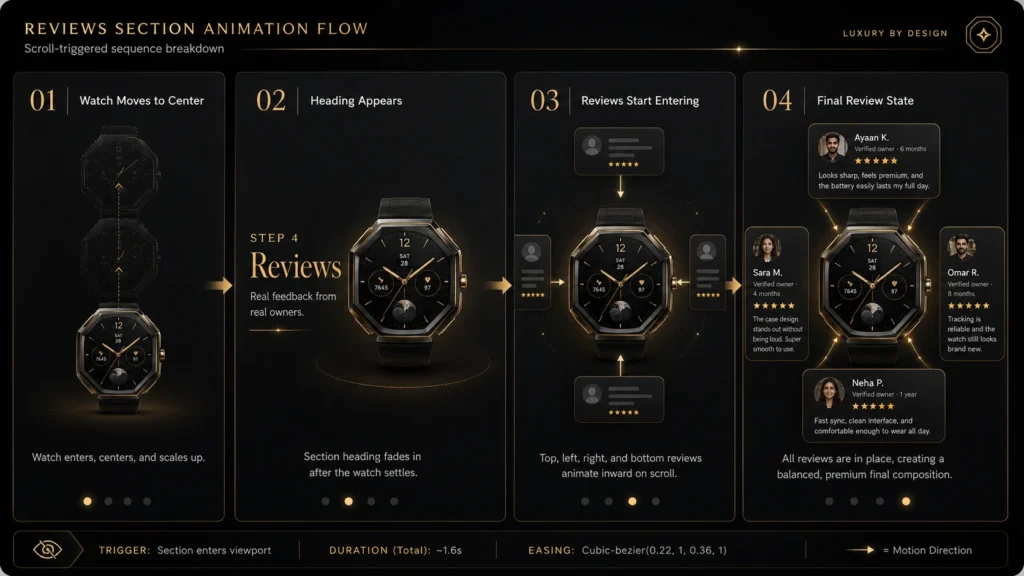
## STEP 4 — REVIEWS (watch center, reviews converge)
– The same octagon watch moves to CENTER and scales up. As the user scrolls, reviews appear one from each direction — TOP, LEFT, RIGHT, BOTTOM — converging around/over the watch.
– 4 reviews, 5-star, believable premium-tech copy (name, meta like “Verified owner · 6 months”, short punchy quote, small real-face image slot). Authentic, not glossy-fake.
## STEP 5 — CTA
– A proper purchase CTA matching the vibe: the octagon watch (a colorway or both), a confident line, price, prominent “Buy ORVEL Pulse” button. Clean, high-end close.
## STEP 6 — NAV & FOOTER (light touch)
– A minimal top nav (ORVEL logo + a couple of anchor links + a small buy button) that suits the design, and a simple footer (logo, quick links, socials as SVG, copyright). Keep both understated so they don’t compete with the hero.
## IMAGES & ASSETS
– Use Magnific for: the watch (3D/image), the hero video, review faces if useful. Any asset not generated → styled placeholder with comment EXACTLY: `<!– IMG: [description] | [ratio] | [WxH]px –>`.
– Curtain panels, connector lines, UI chrome, icons, dividers, the BPM line = pure CSS/SVG.
– If a GLB fails to load, fall back gracefully to a clean image of the same watch so no section breaks. If the Magnific video fails, fall back to the finalized watch still-image with a CSS zoom so the hero still works.
## PERFORMANCE & POLISH
– Smooth 60fps scroll; no layout jank. Respect prefers-reduced-motion (offer a calm fallback). Keep the green/accent usage restrained. Ensure text stays legible over video/imagery.
## DESIGN — cohesive throughout
Commit to one identity and carry it across every section. Before code, write a 3-line Design Rationale (vibe, fonts, palette hex, why).
## QUALITY BAR
Real frame-scrubbing hero, a pulse-triggered curtain transition, the SAME unique octagon watch in every static section, converging reviews, a strong CTA. Judged against another top model — make it distinctive and cohesive.
FOR THOSE WITHOUT MAGNIFIC MCP
The block above uses the Magnific MCP to generate images automatically. If you don’t have it connected, here are your options.
Connect Magnific (free). Magnific (formerly Freepik) connects to Claude via MCP, and the free plan gives you up to 20 AI images per day on the in-house model, enough for this whole project. Setup:
Or use any other AI image tool. No MCP, or you prefer something else? Generate each image by hand, save it, and drop it into the placeholder. Good free options:
- Magnific / Freepik, 20 free AI images a day
- Google Gemini (Nano Banana), best free option for volume
- ChatGPT, works but low free daily limit
- Any AI image tool you already use
Or use free stock. Prefer real photos? Search “pizza,” “cheese pizza,” “person portrait” on Freepik, Unsplash, or Pexels and drop them into the same slots.
Whichever you pick, keep the placeholder format so every slot is easy to find and fill:<!-- IMG: [description] | [ratio] | [WxH]px -->
And keep the rule from above: only food and customer photos are images. The centre pizza, slice icons, delivery rider, social icons, and shapes stay pure SVG/CSS.